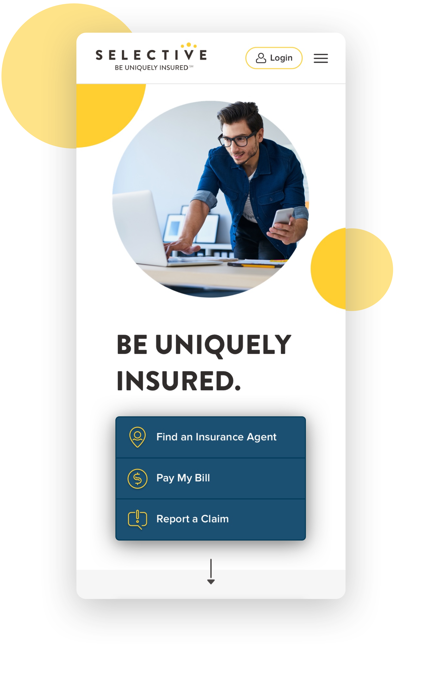
Selective Insurance Site Redesign & Design System
Challenge:
- Selective’s old site was outdated, busy and had a number of usability issues.
-
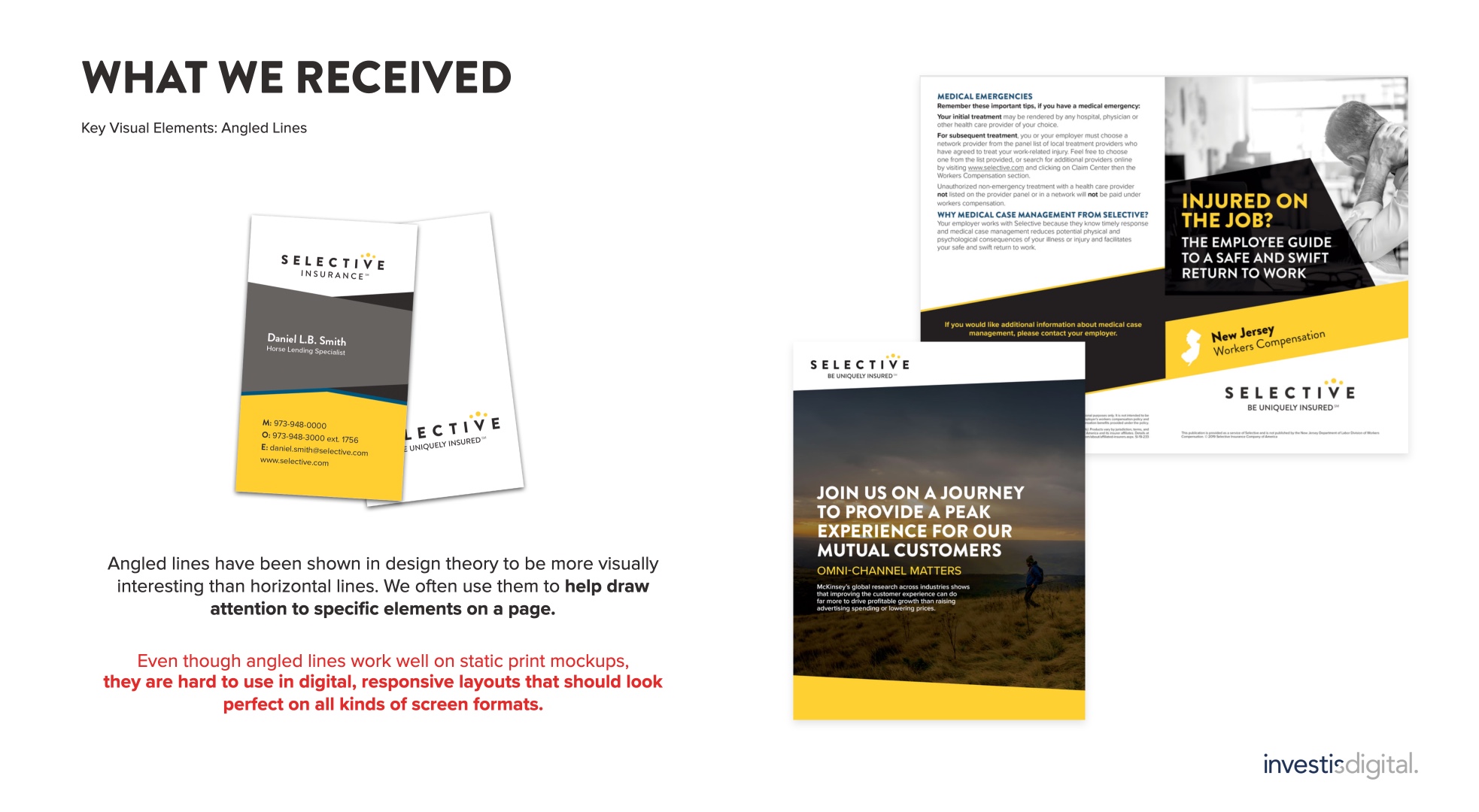
It didn’t communicate company’s vision: to deliver high-tech, high-touch solutions with a prevalence of human element. Selective offers unique, customised solutions with honesty and transparency, and their new website had to reflect that.
-
Selective has over 60 unique products for businesses. They struggled to make them easily accessible for users without overloading navigation and landing pages.
- Selective’s site has direct logins for three different types of users: clients, agents and employees. Additionally, each login has a flood subdivision with a third party login functionality. The old design caused issues for flood related audiences, they struggled to find where to login.
- Selective’s inhouse team of designers and content creators needed simple and powerful tools for frequent content updates.
Solution:
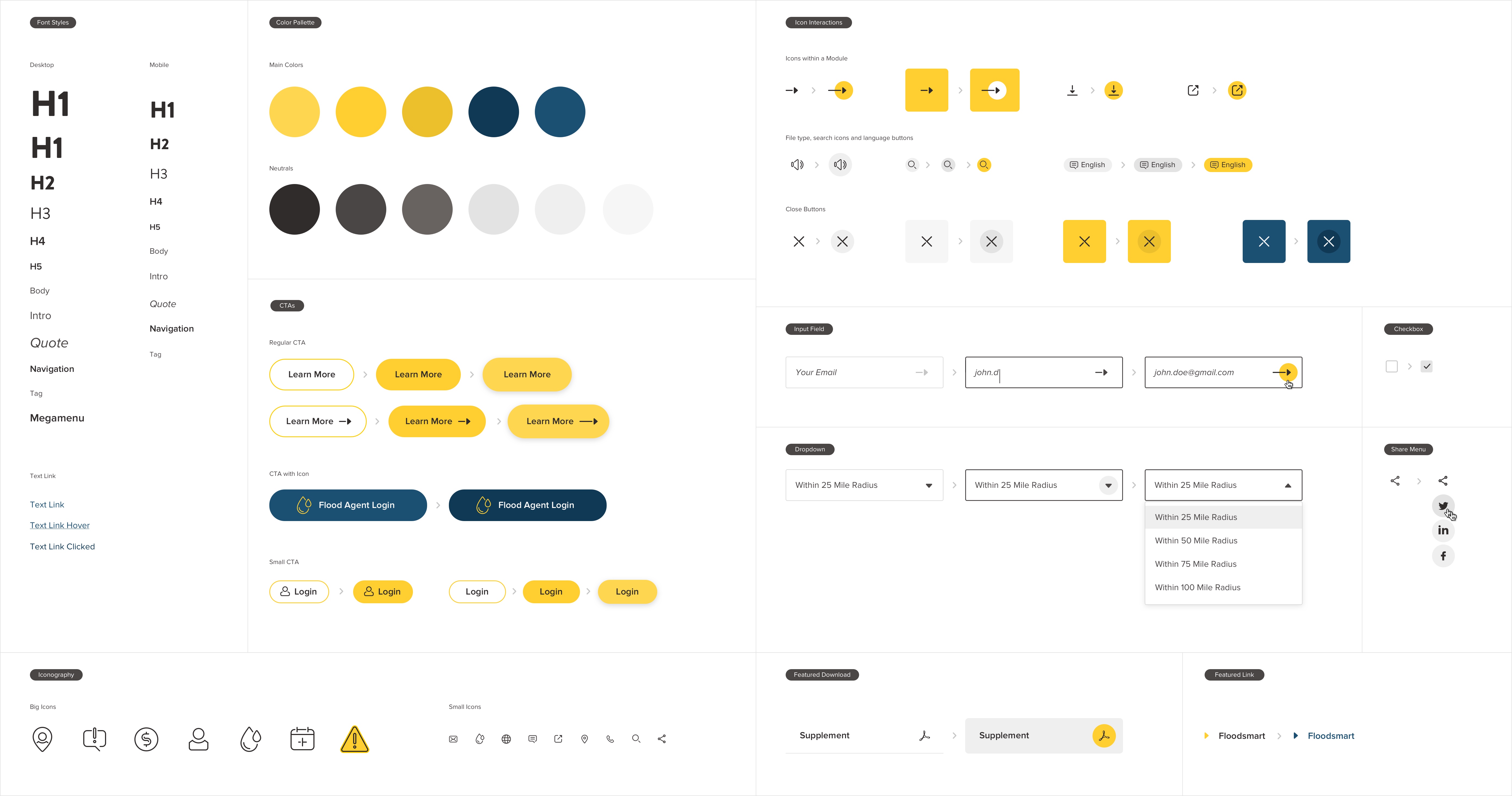
- Leverage Selective’s branding, by develping a visual language that will communicate Selective’s vision, values and brand voice through every aspect of design.
-
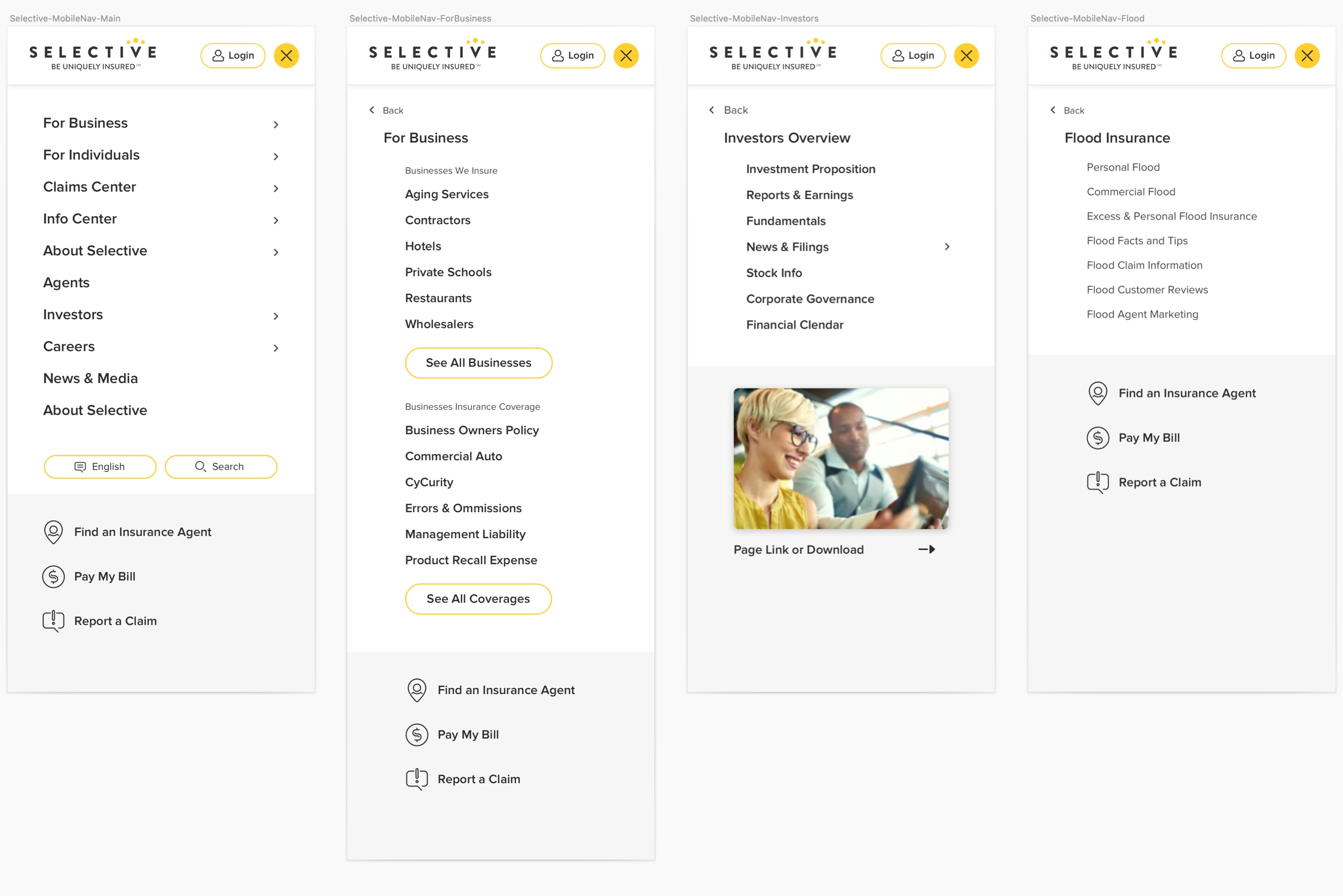
Redesign navigation, featuring the most popular products and a link to the full list, provided on a products’ landing page. This solution was selected through A/B testing, competing with a full list alphabetically splited into groups within a megamenu.
- Redesign login menu, adding a unique “flood button” for all flood related interactions.
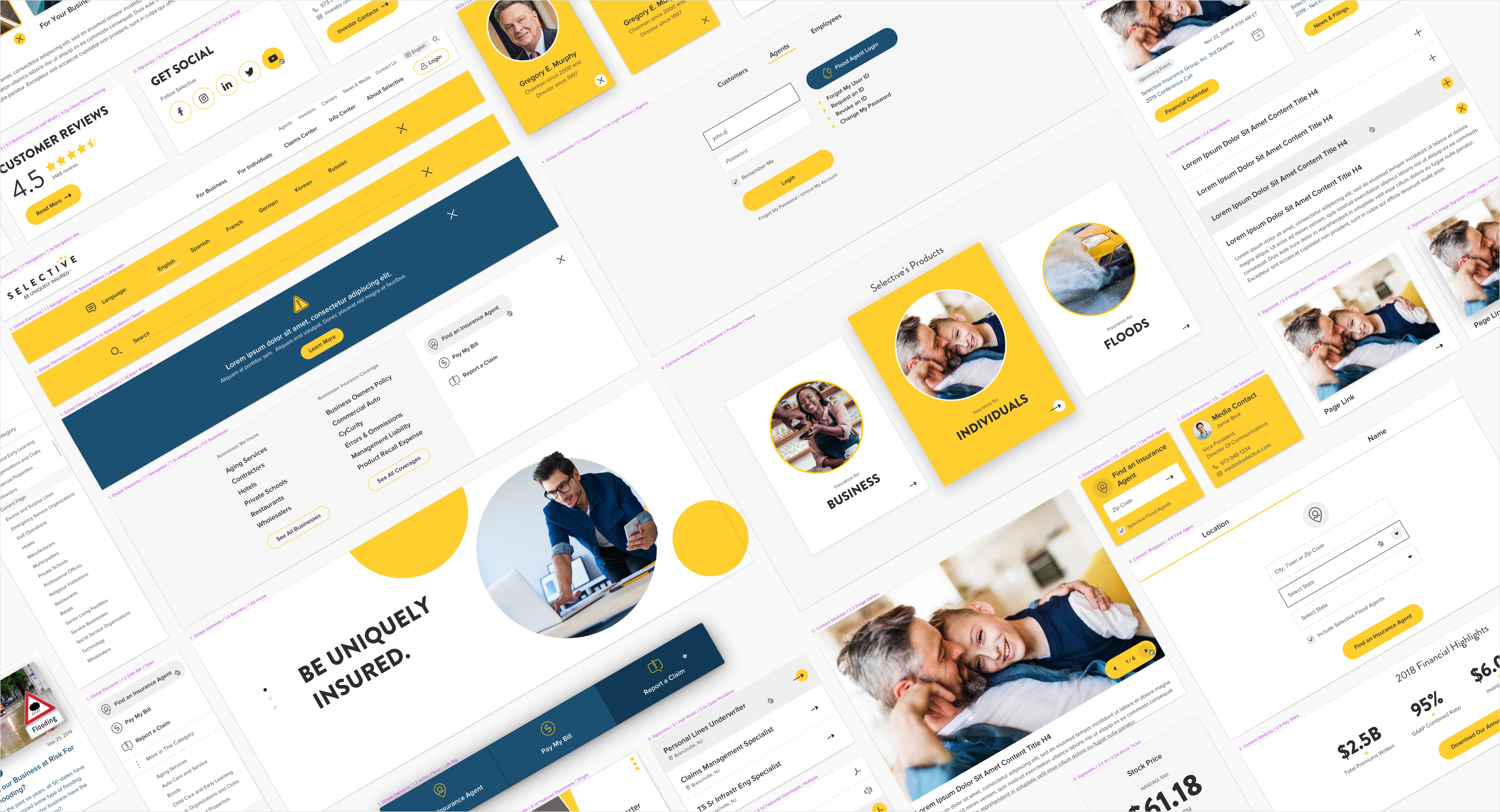
- Design a flexible design system, full of versatile reusable components, to make the inhouse design and content updates fast and easy.
Process:
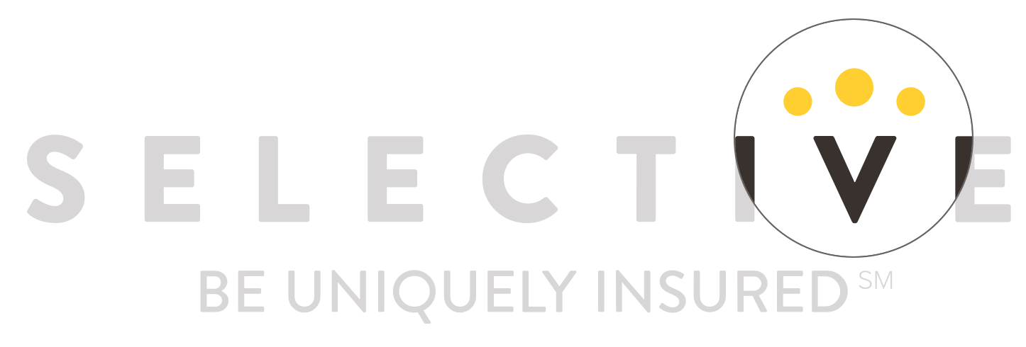
Three circles on Selective’s logo symbolize employees, customers and agents. The central circle is larger and higher, it stands for the customers. I chose to use the circle as a main graphic element of design. People photography framed in a circle with a generous white space emphasizes focus on customers and human element in Selective’s approach. Circles appear in animations and hover states. Main UI elements extend and/or move up on hover, further ellaborating the concept of uniqueness and selectivity. The initial site prototype was well received by the audience, so the chosen stylistic approach was applied on the component library.
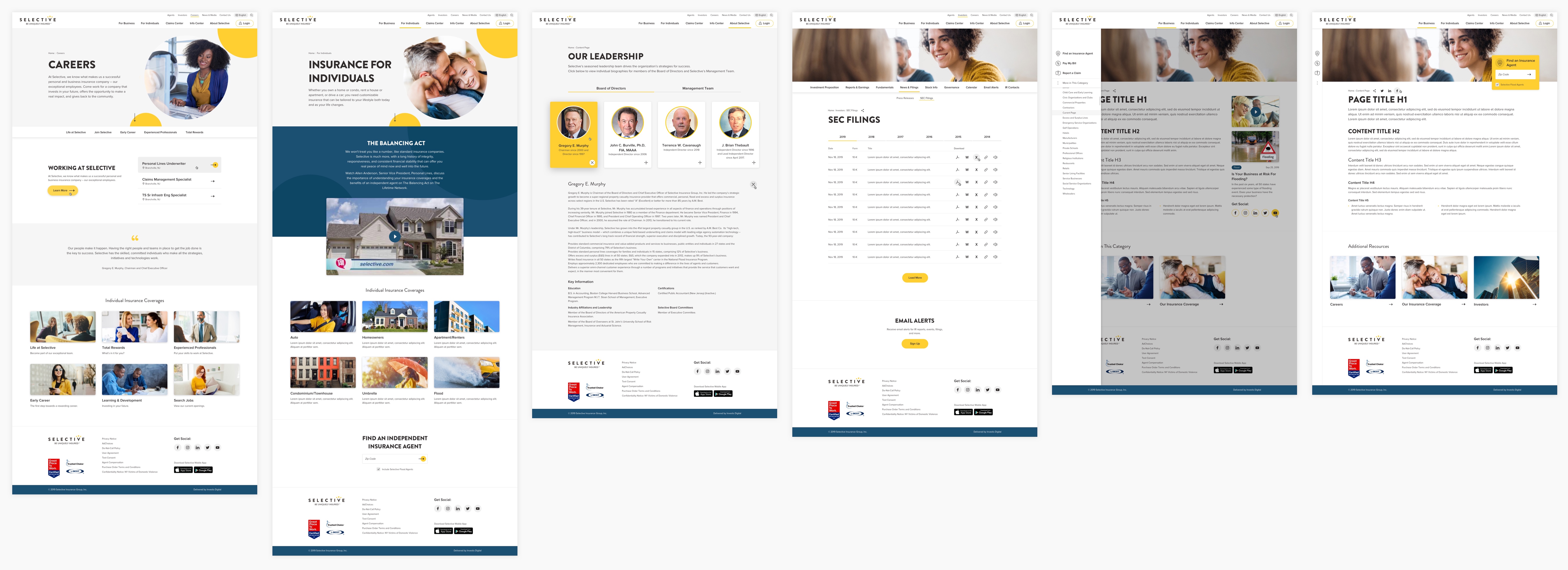
I analysed all pages of the selective.com website and put together all potential modules. I streamilned them, merging similar components into more flexible structures, that could accomodate more varied content.
The existing site content, except home and a few new landing pages, had to remain the same. So I decided to redesign the component library, instead of redesigning the site completely. This allowed our build team to implement a seamless content migration of more than a 100 site pages and stay within a scope, budget and timewise.
In the Selective’s design system I introduced content wrappers: structures that host a group of components frequently used together. For Selective’s team convenience, nested components could be updated directly within the content wrappers, saving time on recreation of complex groups of elements. This approach also insure design consistency during updates.
Many of the components were reused with slight modifications, like changes of font styles or image size (I always try to keep image proportions consistent through as many modules as possible for easy updates). So I created a modular library map, that shows which components must be reused where and either they are in original state or modified. The map was used by developers durning build and CMS setup.
My role:
I led the design and oversaw development of the design system and entire website from start to an end. I collaborated with a digital strategist, for the creation of new pages and a team of developers in India.
selective.com ︎︎︎
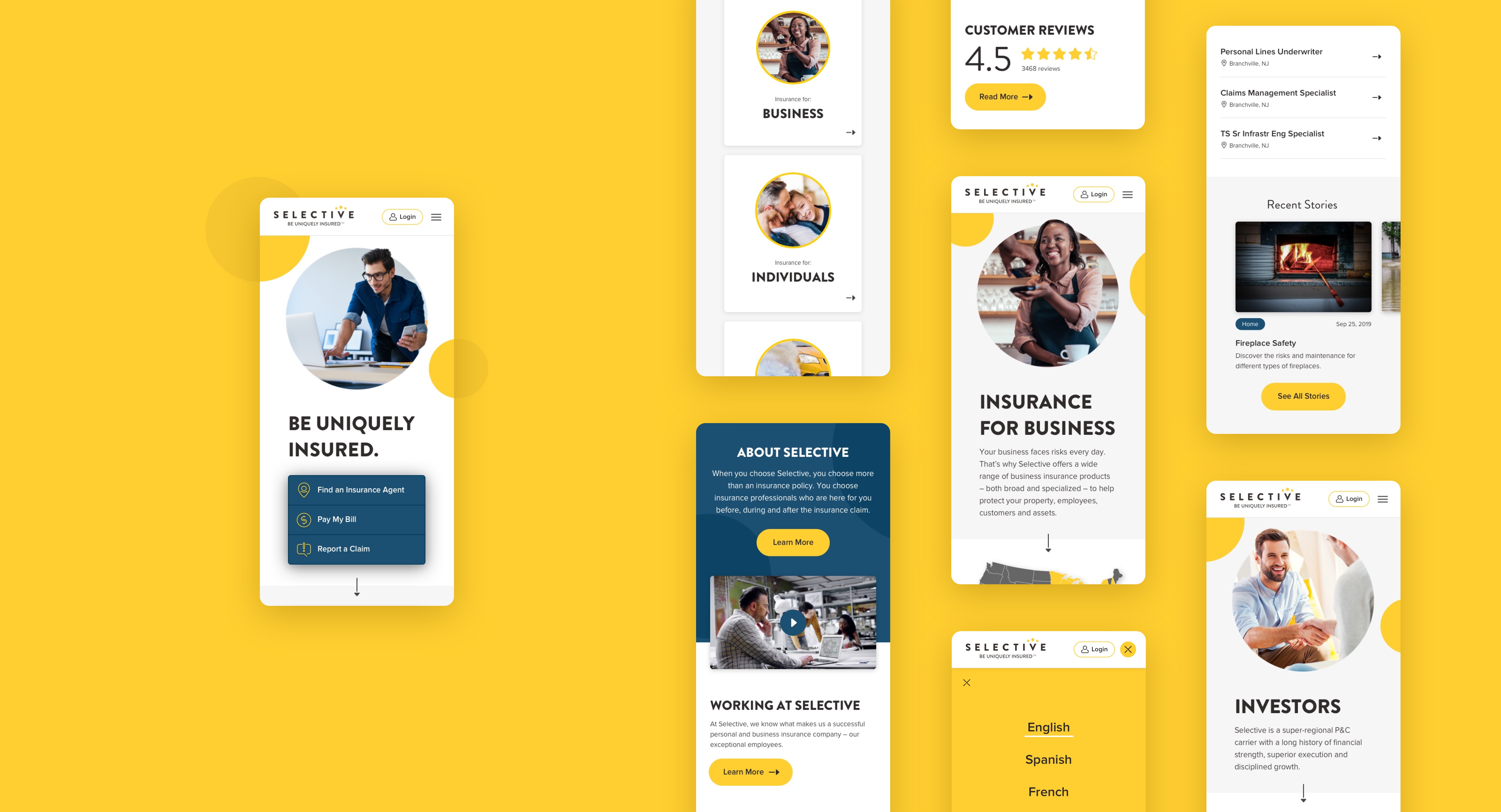

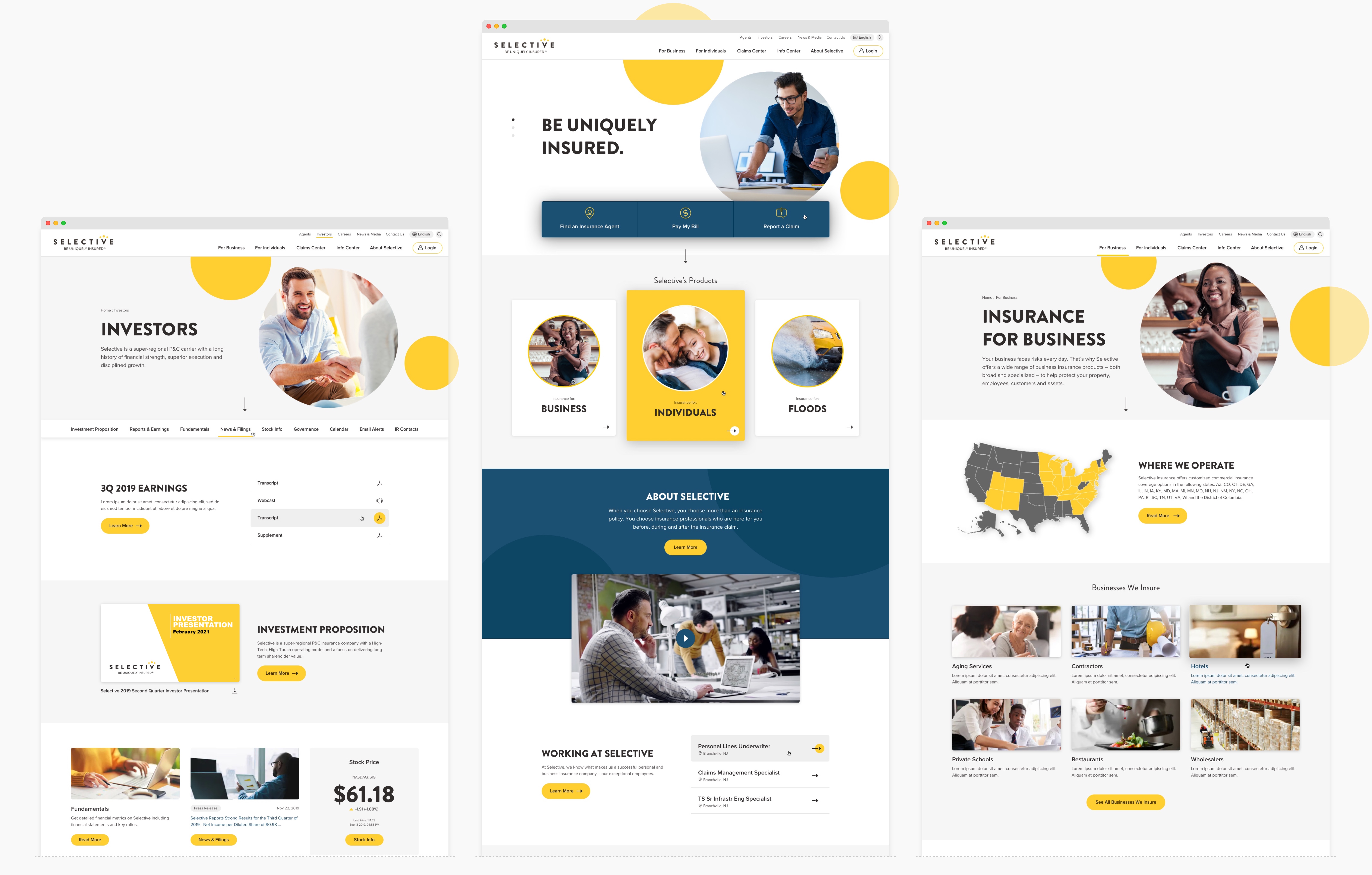

Selective’s home page before and after.
Process Process Process Process Process
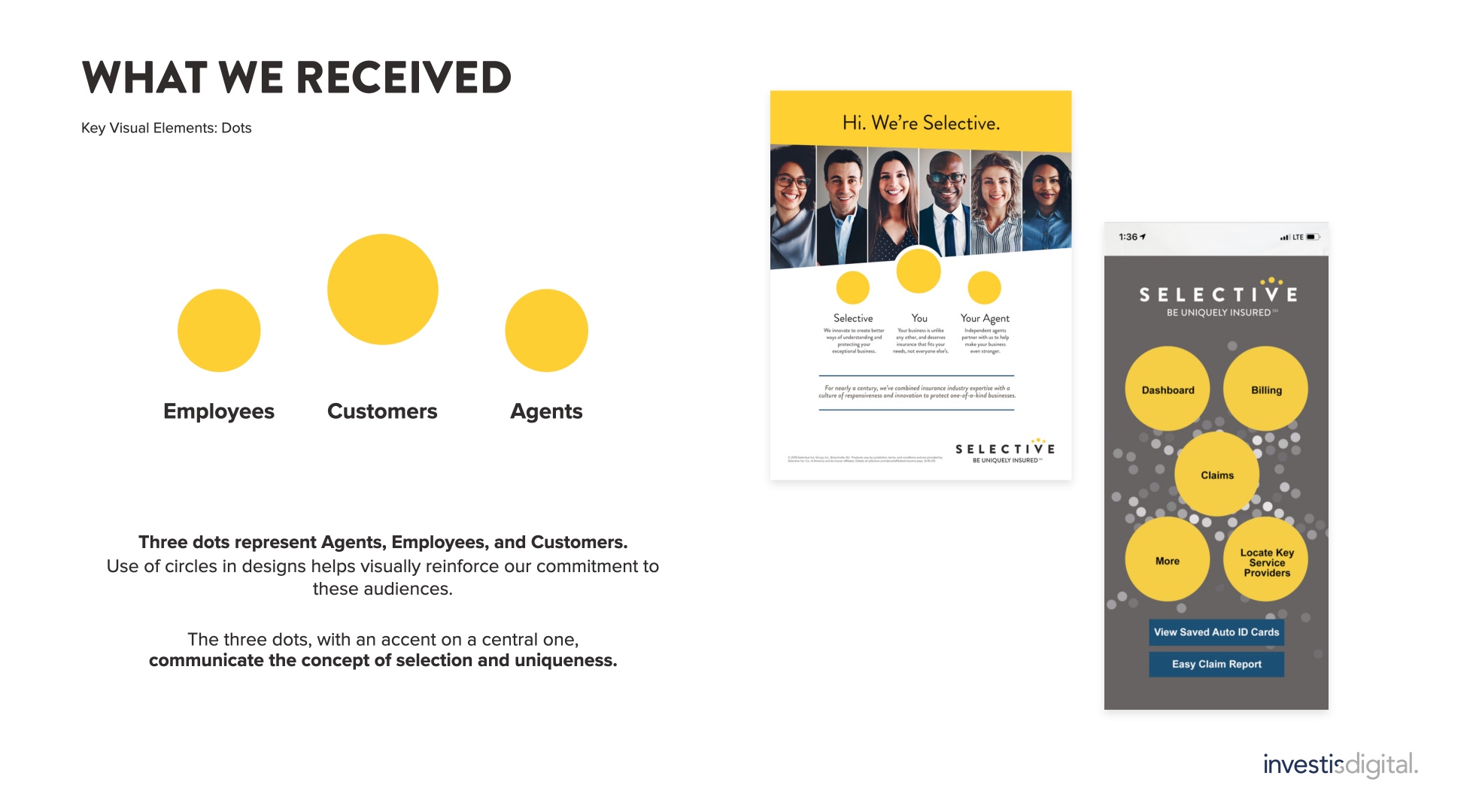
Three circles on Selective’s logo symbolize employees, customers and agents. The central circle is larger and higher, it stands for the customers. I chose to use the circle as a main graphic element of design.


People photography framed in a circle with a generous white space emphasizes focus on customers and human element in Selective’s approach. Circles appear in animations and hover states. Main UI elements extend and/or move up on hover, further ellaborating the concept of uniqueness and selectivity.
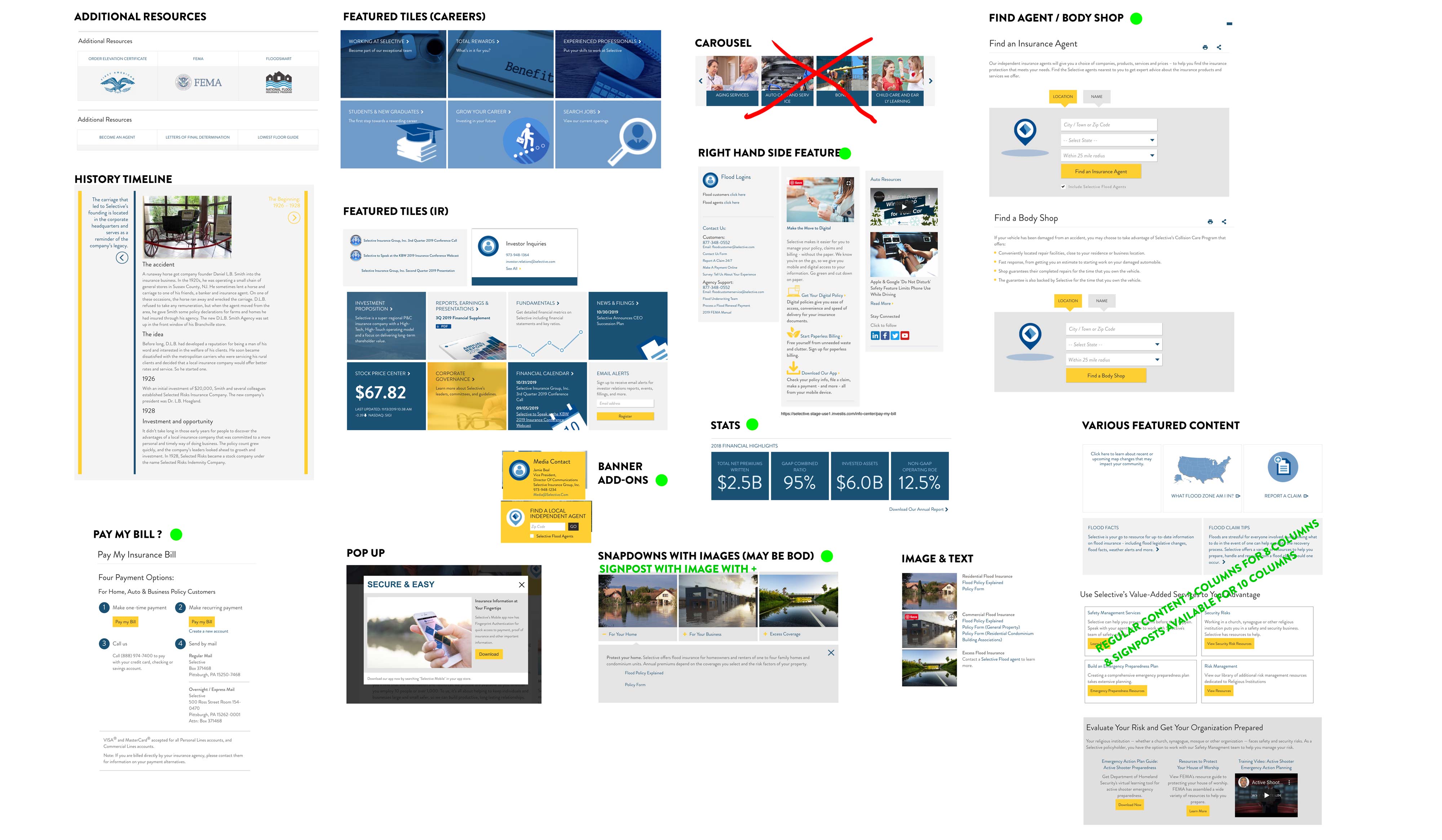 I analysed all pages of the selective.com website and put together all potential modules. I streamilned them, merging similar components into more flexible structures, that could accomodate more varied content.
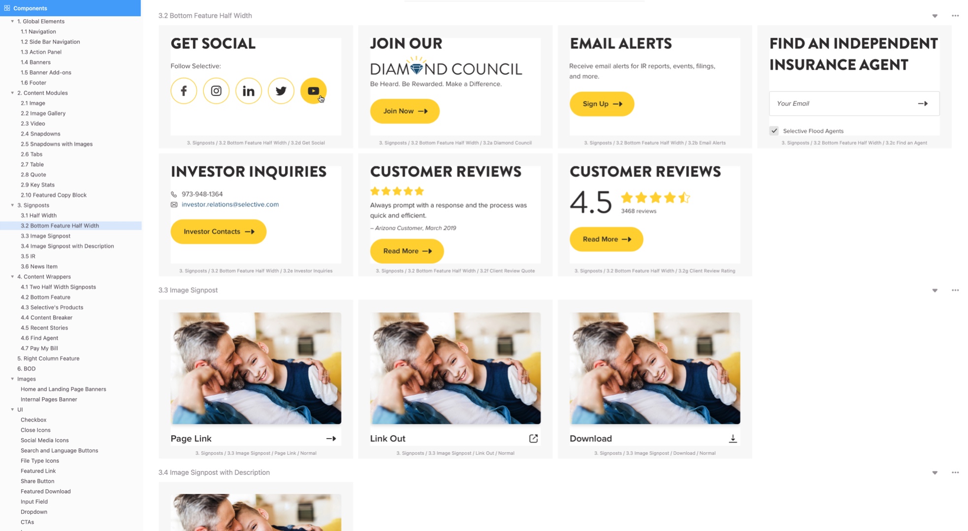
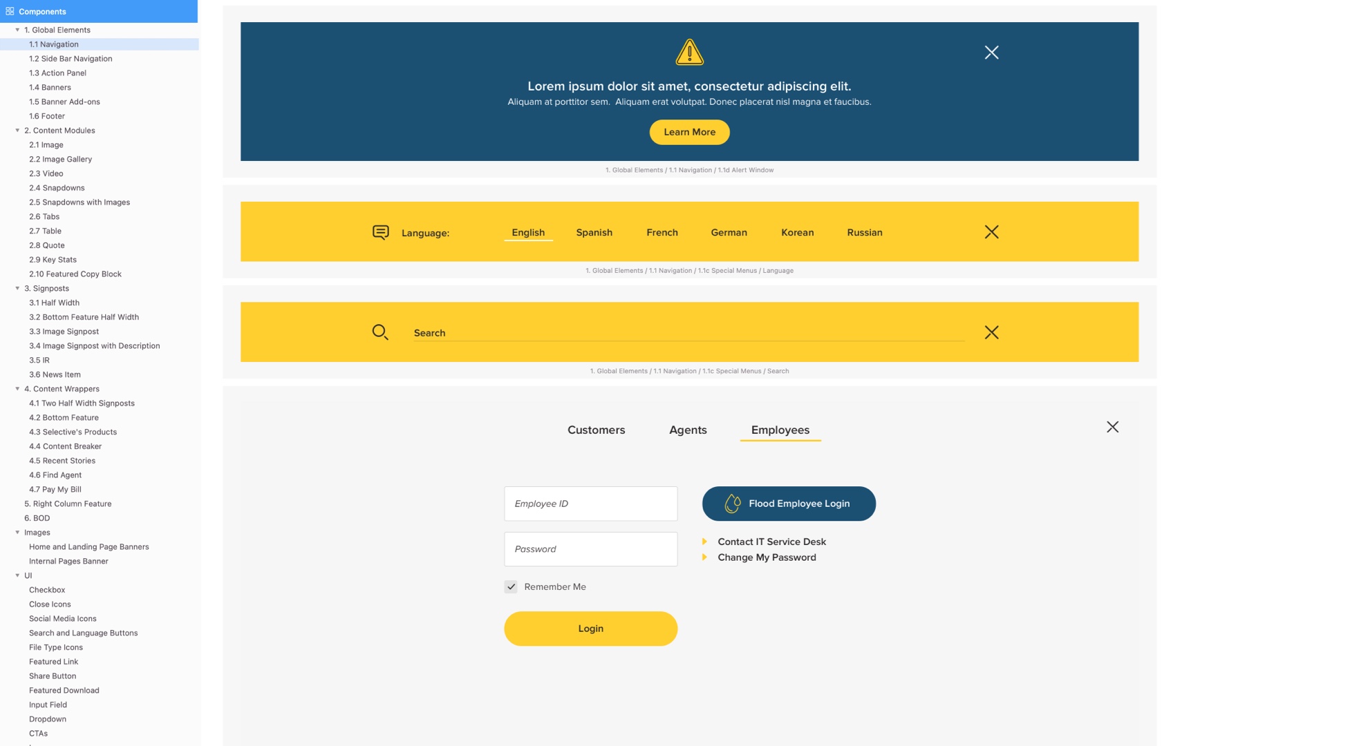
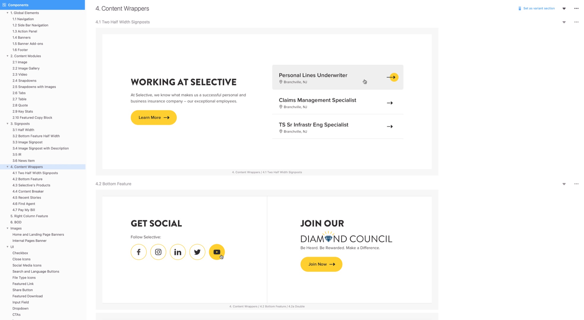
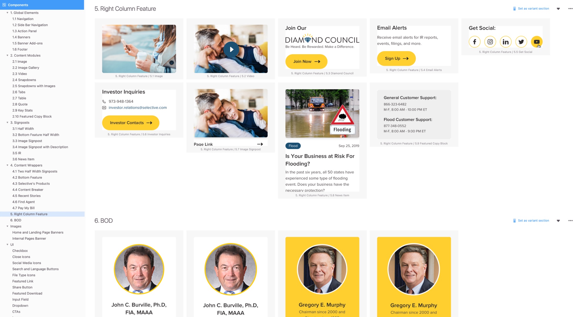
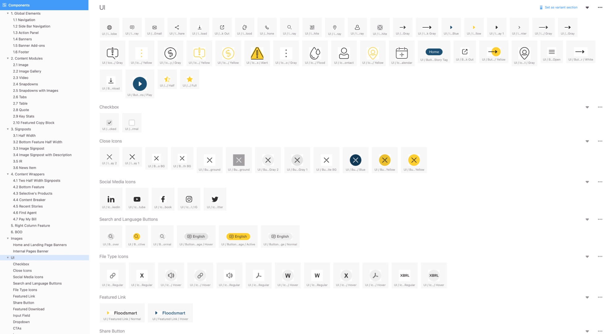
The internal design system, for development team, was set up in Zeplin. Each module had detailed behavior and application description, variations and variables, that must be available in CMS.
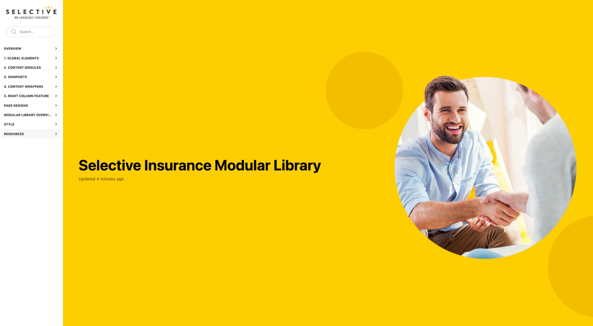

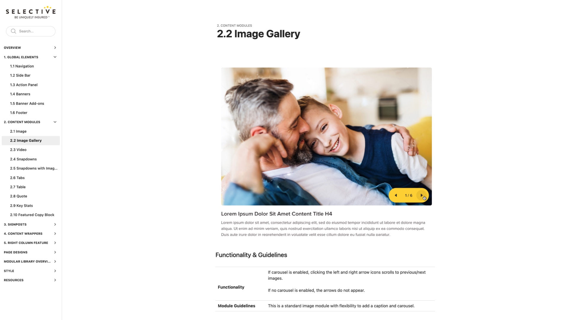
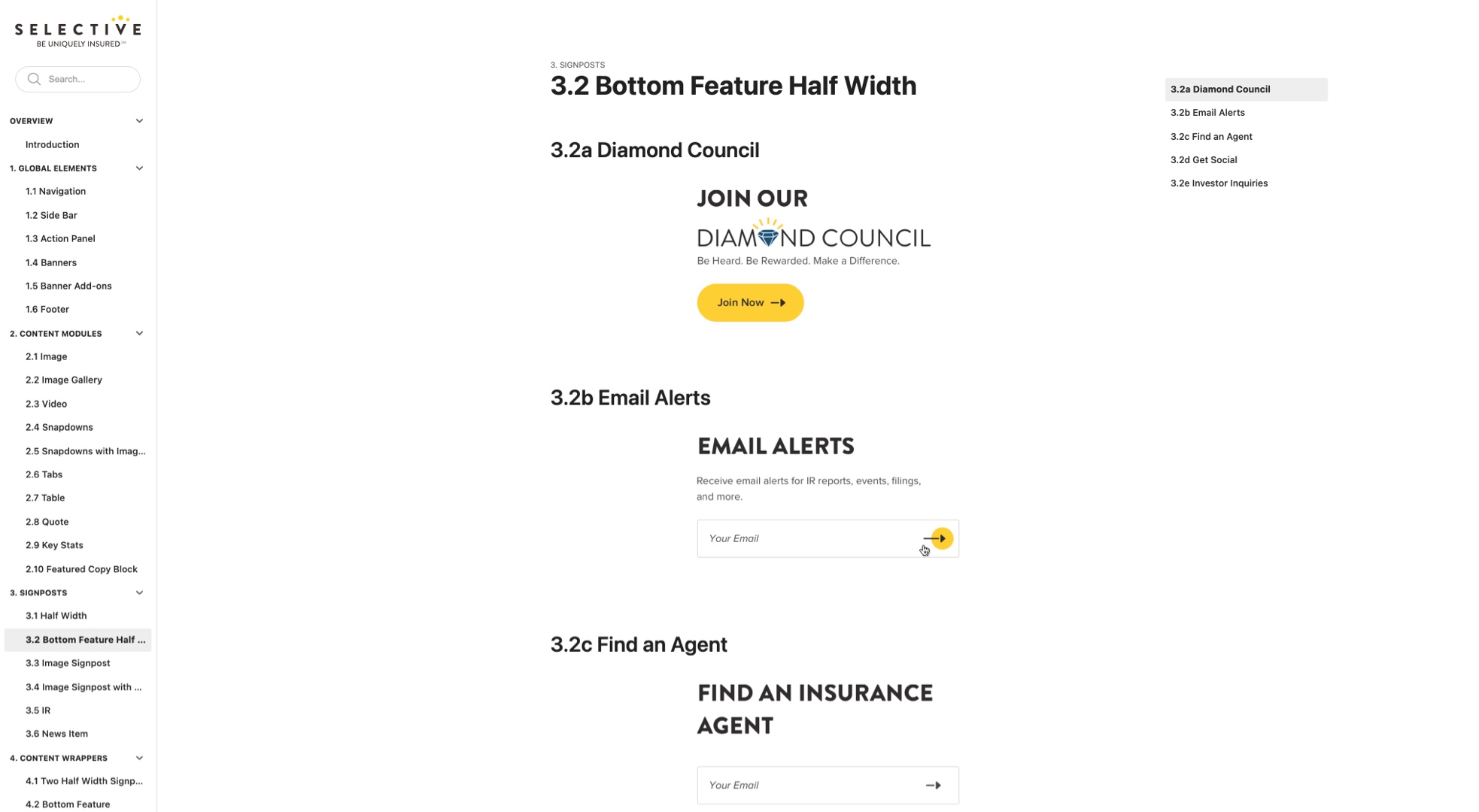

The online design system, for Selective’s team, includes a brief description of modules’ functionality, brief guidelines (where and how to use modules), character count, image sizes, etc. For Selective team’s convenience, site modules (except banners) only use 2 image sizes, that automatically scale up or down, depending on module type.
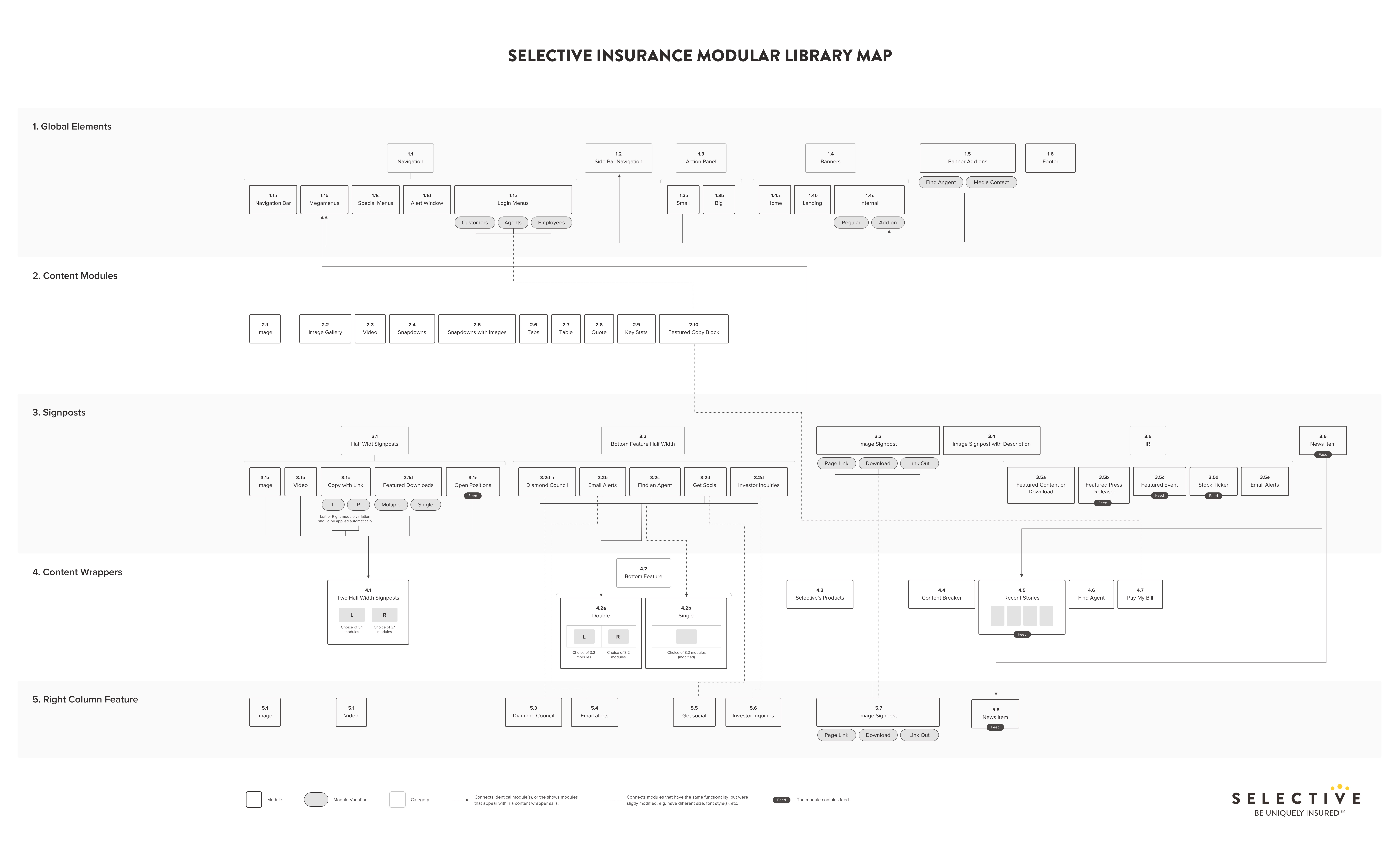
Many of the components could be reused with slight modifications, like changes of font styles or image size (I always try to keep image proportions consistent through all modules for easy updates). So I created a modular library map, that shows which components must be reused where and if they are reutilized in original state or modified. The map was used by developers durning build and CMS setup.