IFF is a leading innovator of sensorial experiences, that creates and produces unique scents and tastes for fine fragrances and beauty, detergents and household goods, and well-loved foods and beverages.
IFF Fragrance Ingredients Database
The IFF interactive database is a tool designed to help potential customers identify appropriate ingredients for their purposes, and request samples. It is built with an assortment of filter, search, and sort functions, and provides downloadable ingredient sheets for customer reference.
The previous version was also designed by me a few years ago. At that time, I redesigned the initial version of the database, setting a foundation that performed well through the years. The very first version had a confusing, busy interface. Each filter opened in a separate dropdown, forcing user to make enormous amount of clicks. I came up with a solution utilizing a unified multi-select filter. The tool was a huge success among IFF’s customers. It performed well and didn’t have to be dramatiaclly redesigned.
Challenge:
During this projects, my goal was to refresh a visual design, along with a global site update, and do some updates to the tool’s filter.
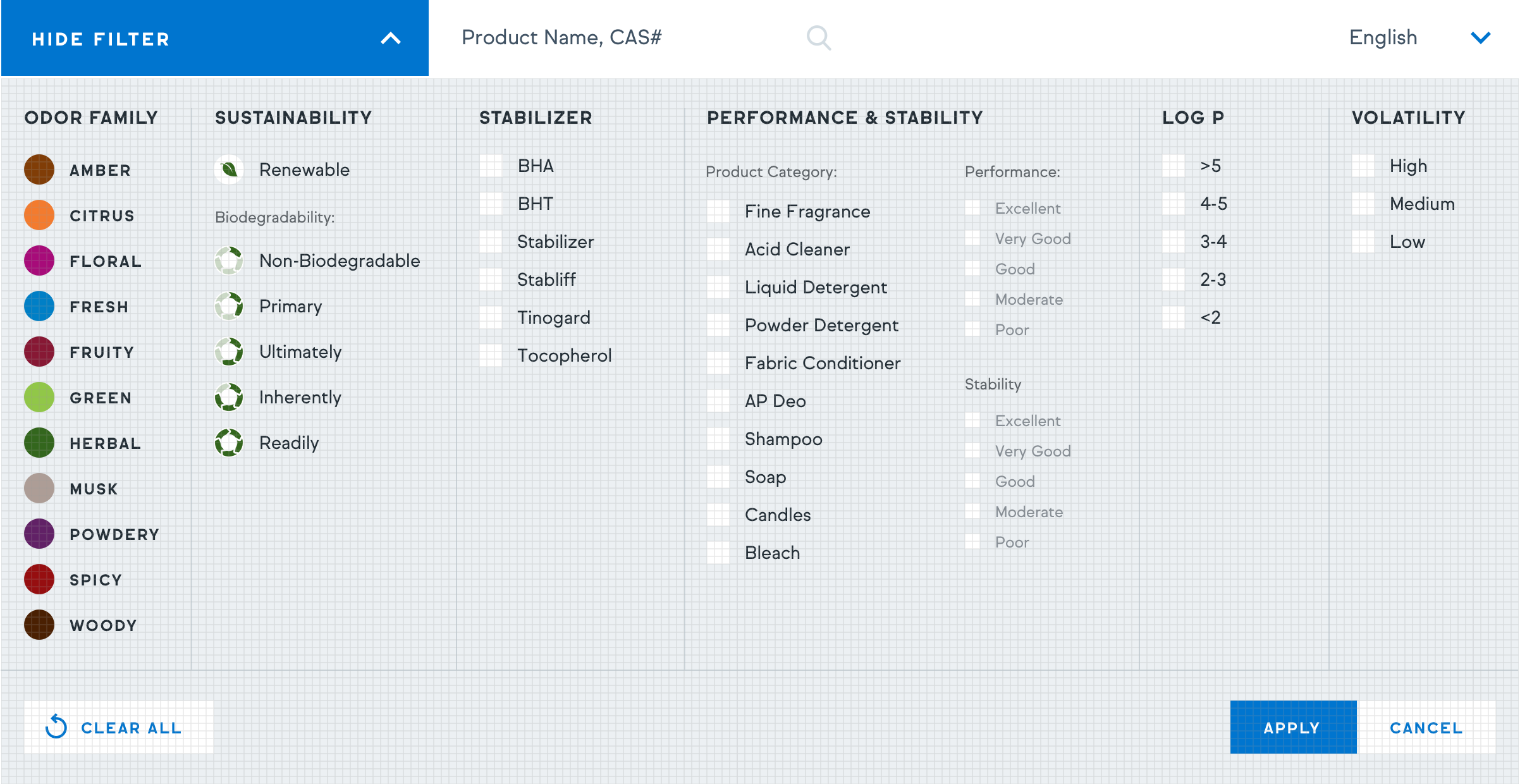
The main update was addition of sustainability section, which is company’s global priority at the moment. The section included two variables: renewability (renewable/not renewable) and biodegradability (five stages.) These parameters had to stand out.
Solution:
I created a leaf icon for renewable ingredients. The icon appeared in the filter and next to an ingredient name on the list. As for the biodegradability, I came up with a wheel icon, that visually demonstrates a level of biodegradability. The appropriate icon was assigned to each ingredient. The use of icons made it easy to define how sustainable each ingredient is without opening the full ingredient specs.
Due to internal reasons, the intermediate iframed version of the tool was pushed live during the site redesign phase. The final version is scheduled to launch later on.
My role:
I led the design and oversaw development of this project, collaborating with a remote team of developers in Vadodara, India.
Visit the iframed version of the tool ︎︎︎
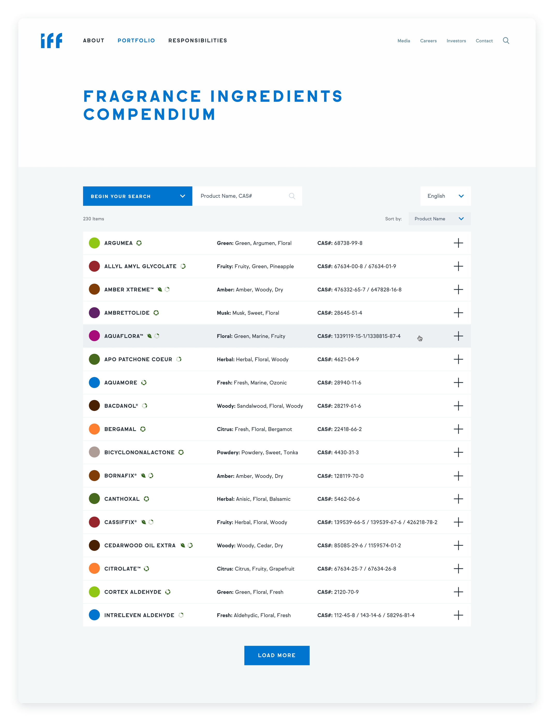
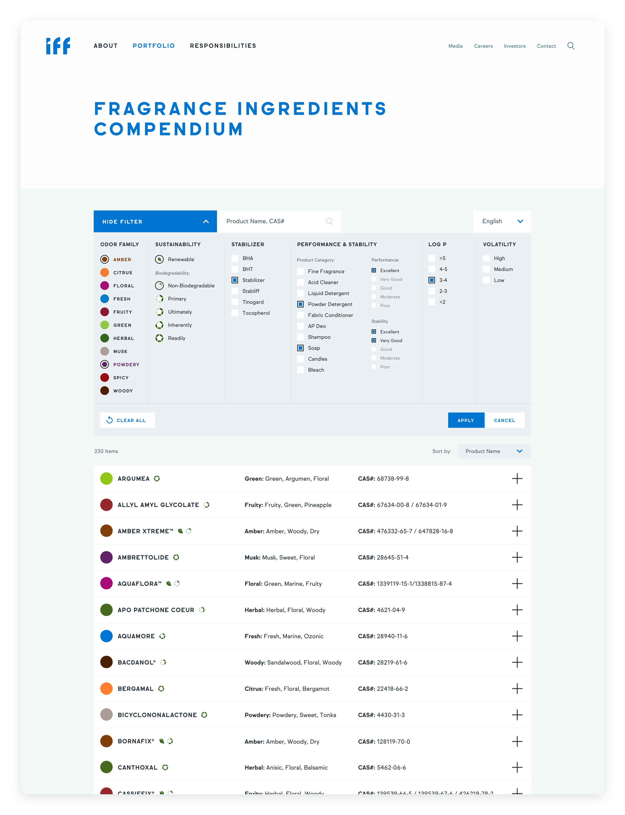
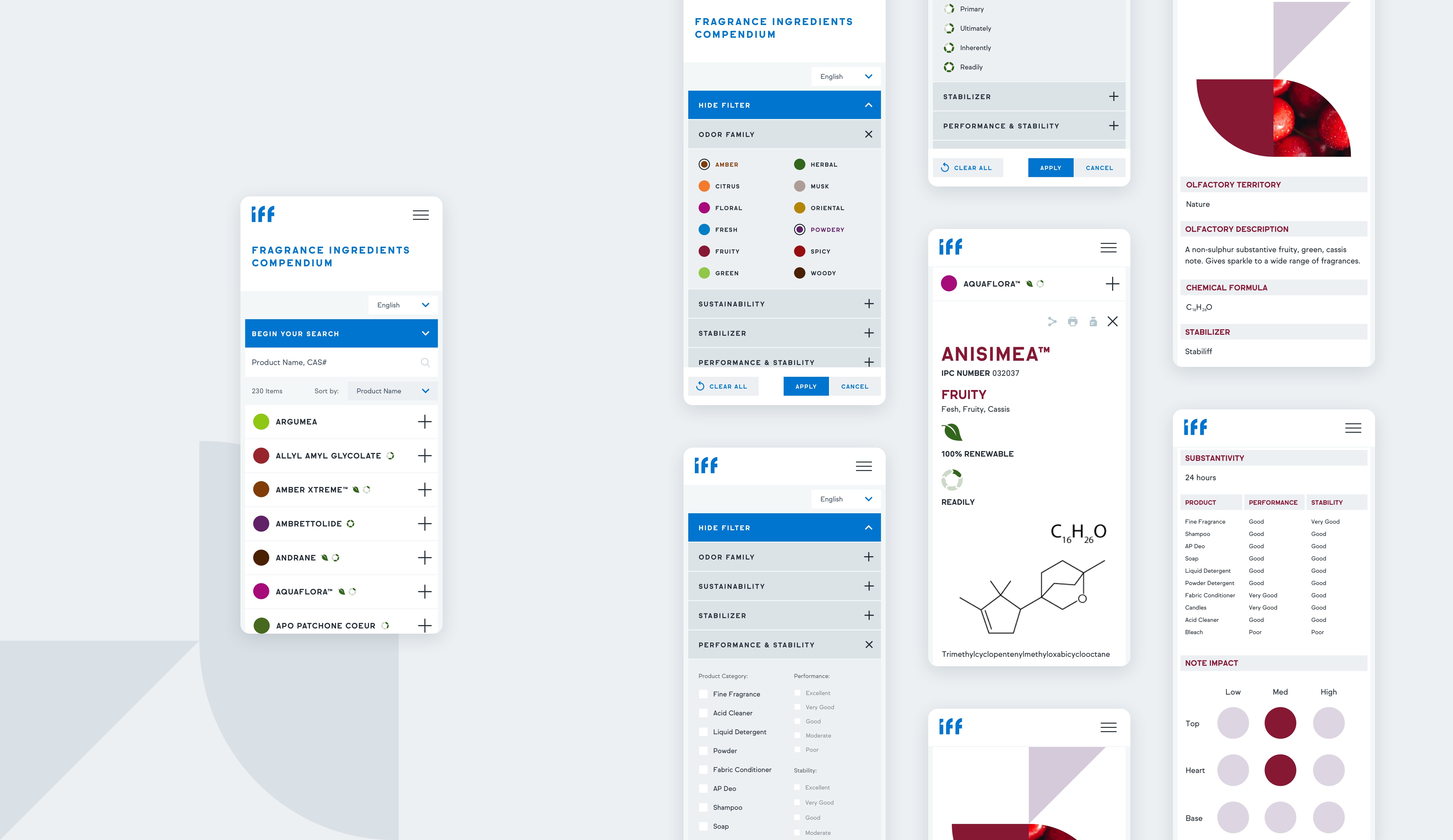
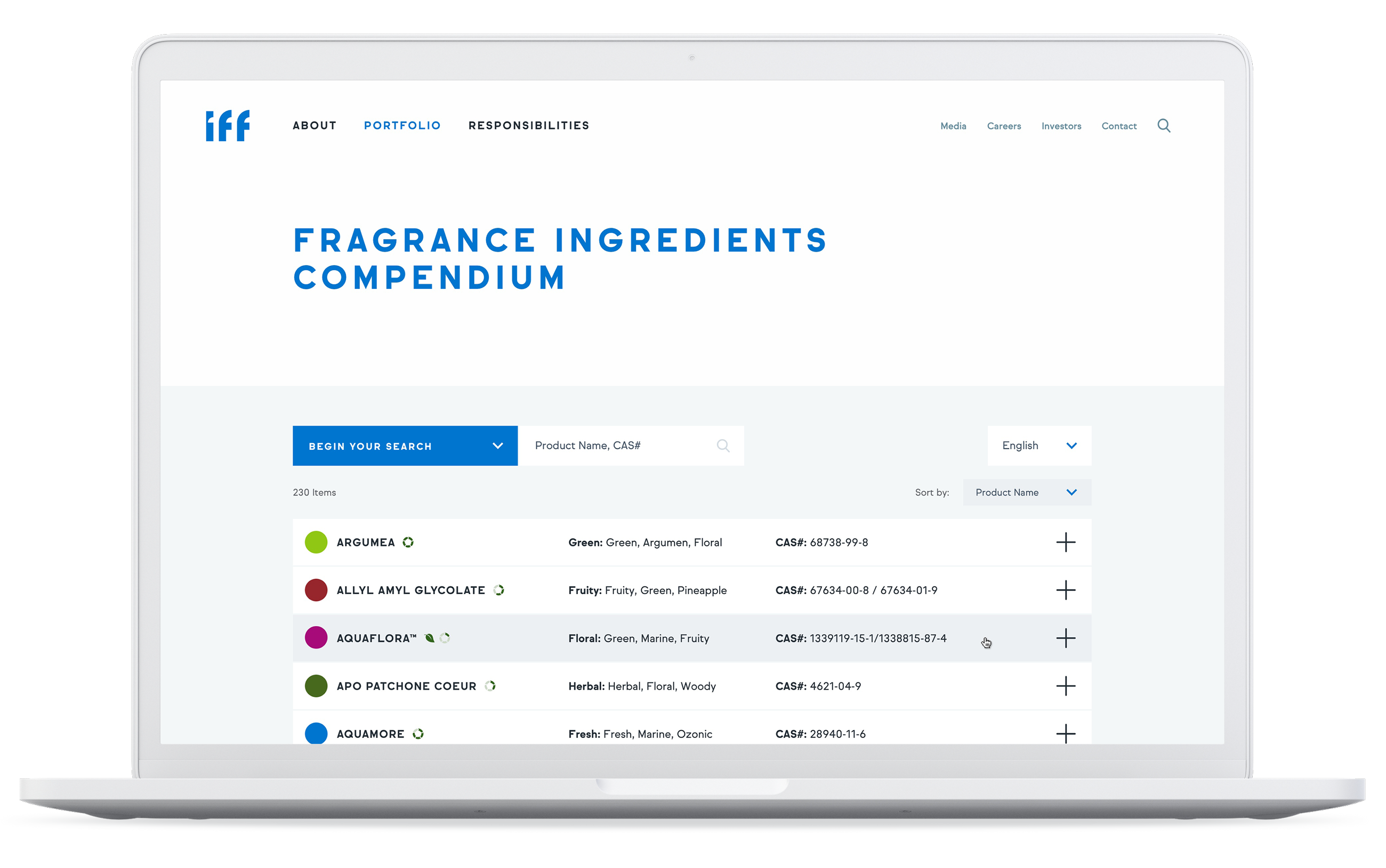
The desktop and mobile versions of the database. The filter is converted to a stack of snapdowns on mobile, which appears rather long if opened all together. to address that, I implemented a fixed footer with clear all, apply and cancel buttons. This lets user to avoid unnecessary scroll to the very bottom and enables faster filtering.
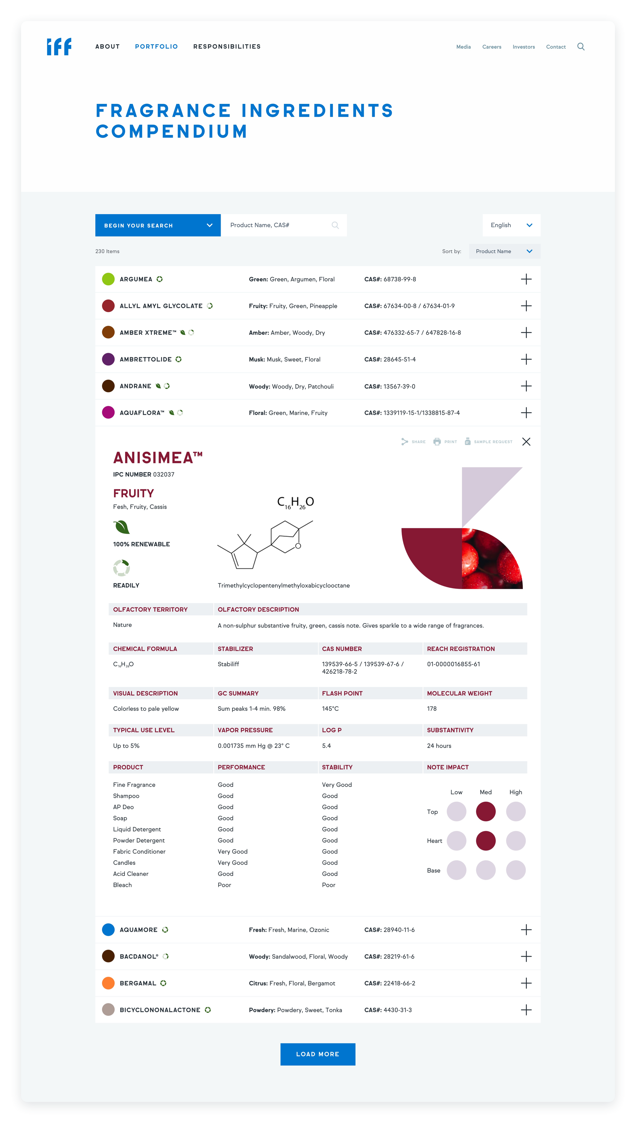
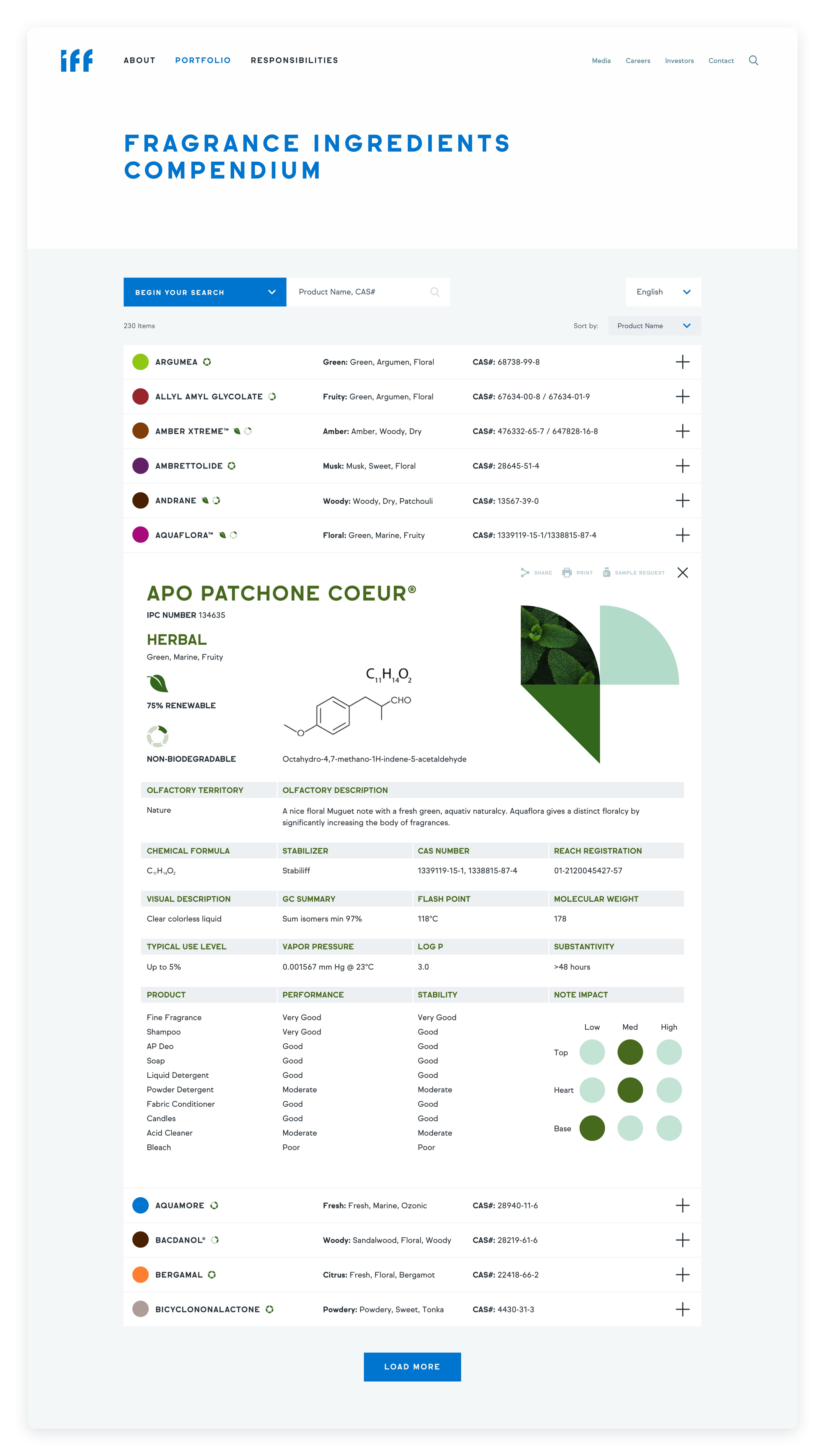

The previews of ingredient details. The ingredients are color coded based on odor family. Additionally, each family is associated with an abstract graphic element, that I created along with global rebranding and site redesign.
