IFF is a leading innovator of sensorial experiences, that creates and produces unique scents and tastes for fine fragrances and beauty, detergents and household goods, and well-loved foods and beverages.
IFF Megaplatform Redesign & Design System1
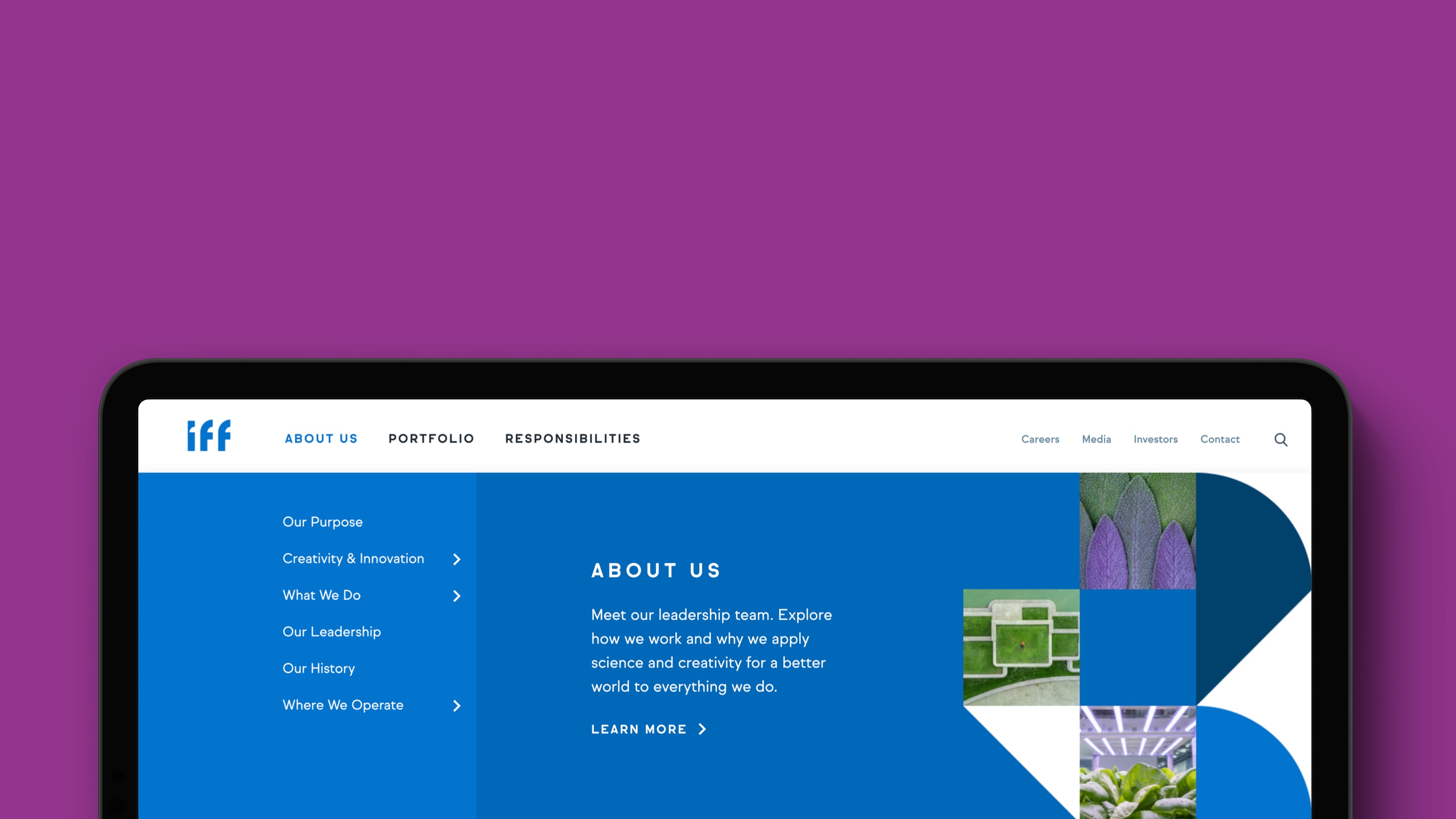
In 2019 IFF acquired their major competitors and went through a global rebranding, implemented by a Denver branding agency Monigle. This prompted an urgent need to redesign and rebuild an old website.
Challenge:
The old IFF website had a templated design and navigation that didn’t accomodate for deeper levels. They needed a scalable platform, that would allow to expand their constantly growing portfolio of markets and products, showcase environmental and social initiatives and attract and inspire talent.
Due to a tight timeline, design and build had to happen in parallel with content creation.
Solution:
Flexible design system with a comprehensive library of reusable components, easily accesible via CMS.
Process:
After the series of interviews with a client, content team and a branding agency, we defined a basic component library. New branding was applied and the design system was ready for build. Once the final content was available, we had to modify and add a few new modules, but it didn’t affect the timeline dramatically.
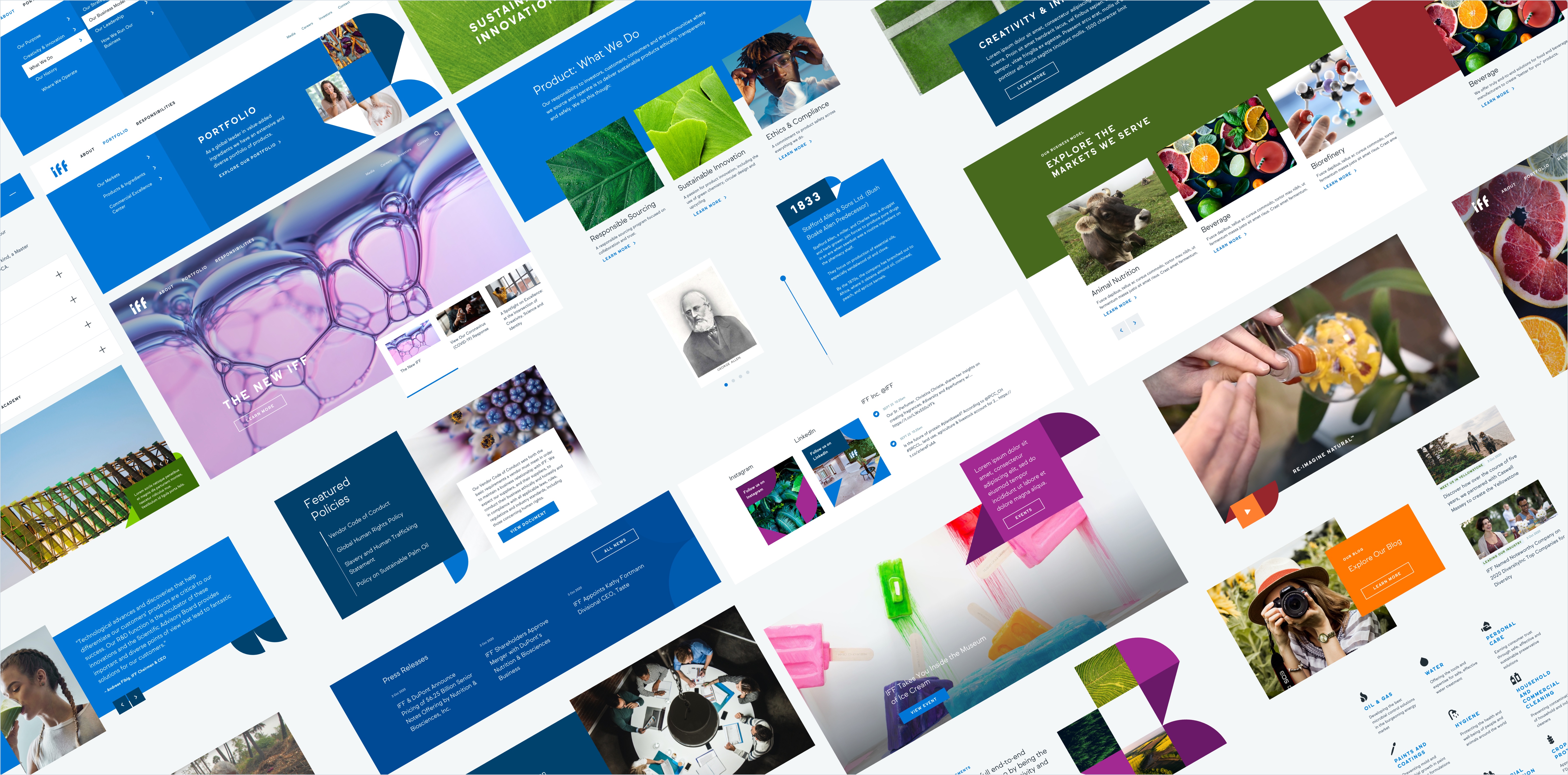
I put together over 70 pages, using the design system and content, provided by client. The rest of the pages were were implemented by IFF’s team.
My role:
I led design and oversaw build of the project from start to an end. I collaborated with a digital strategist Anne Apuzzo and a remote team of developers in Vadodara, India.
www.iff.com ︎︎︎
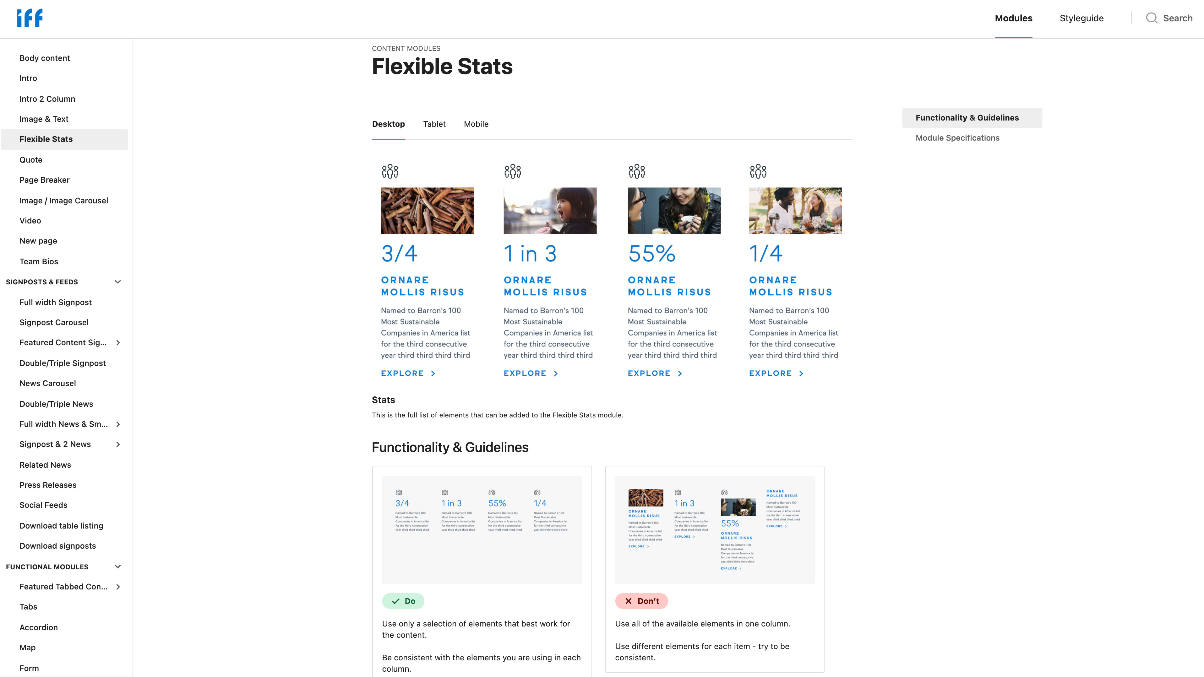


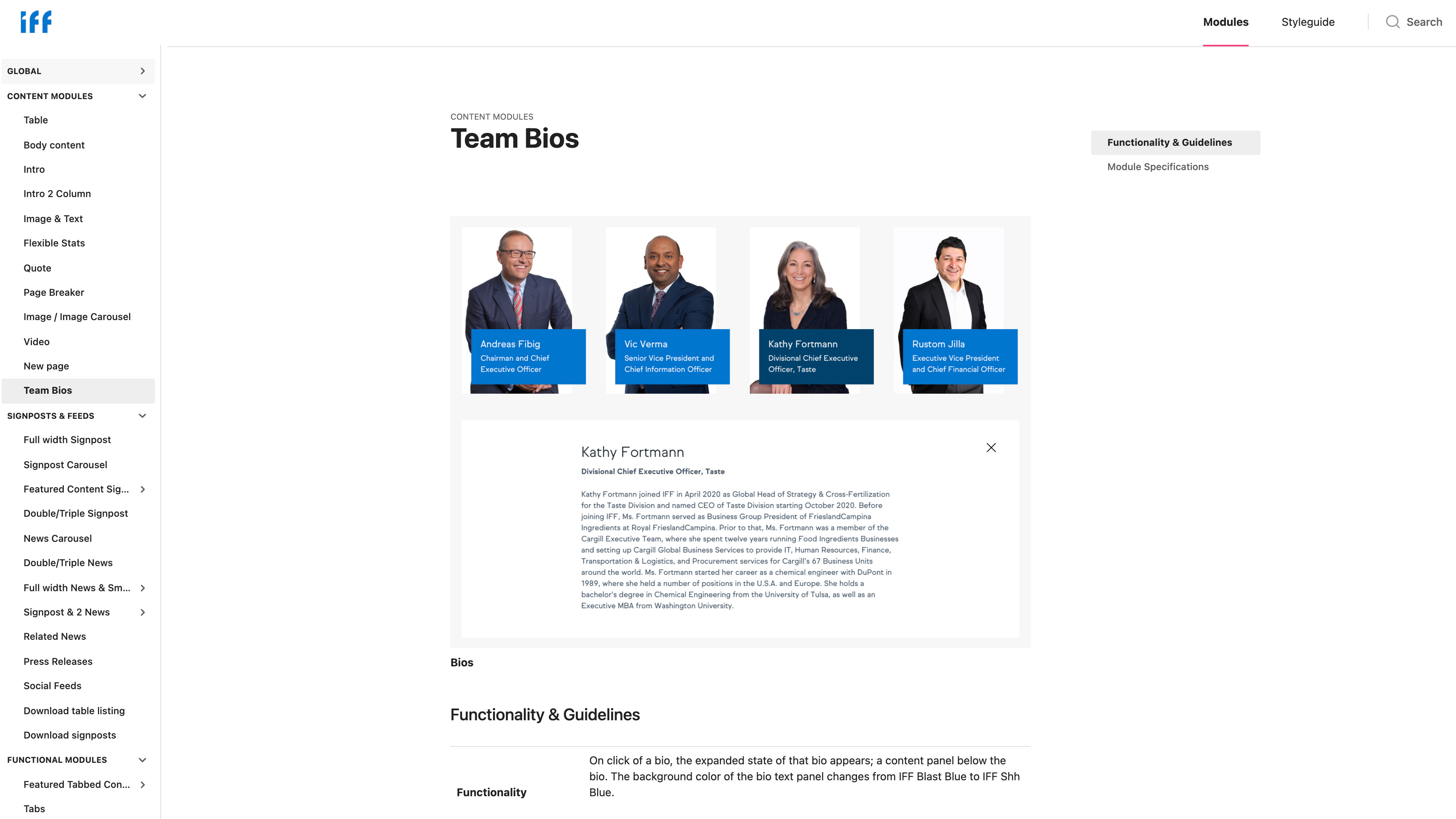
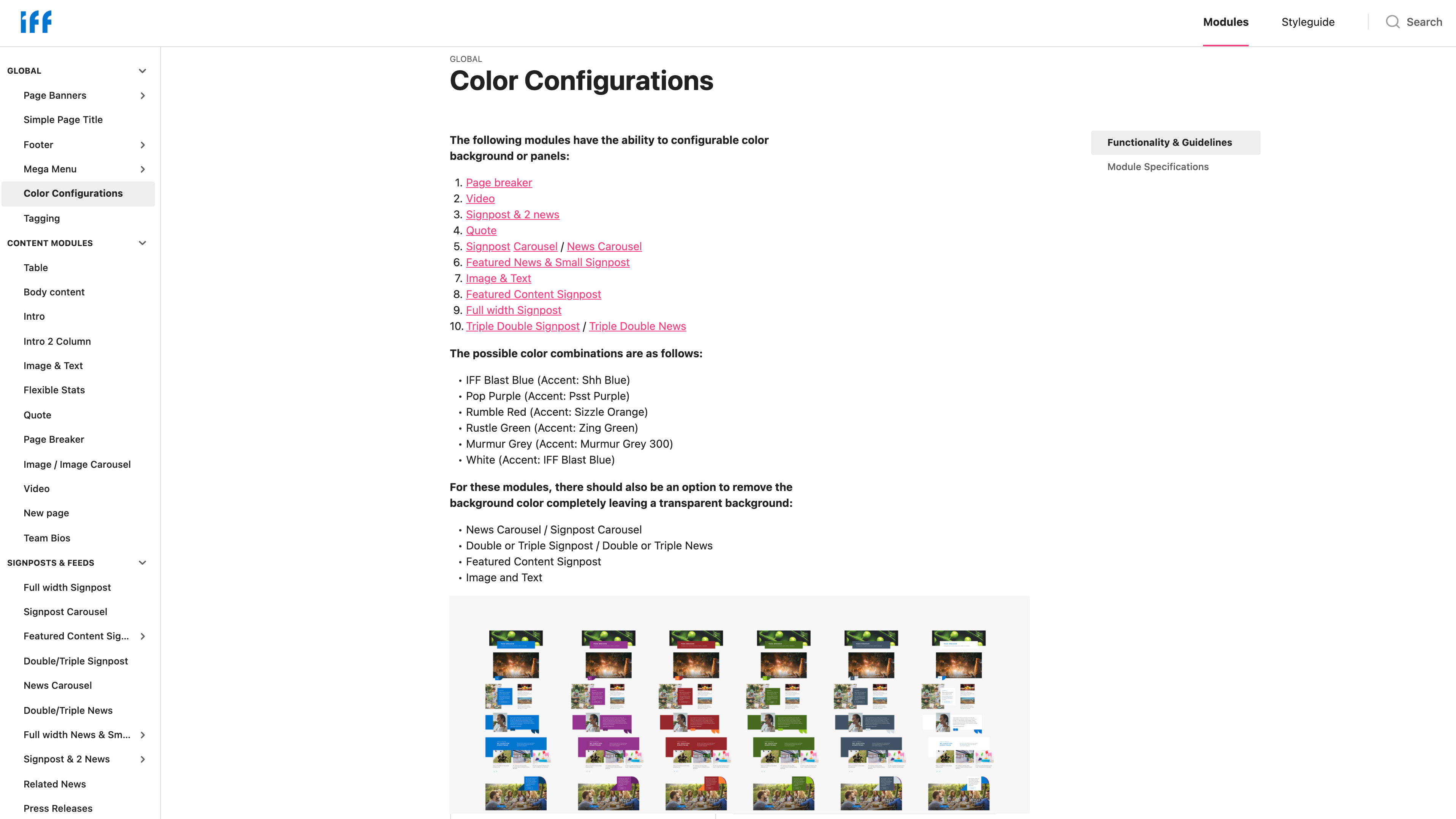
External design system for IFF team.
![]()
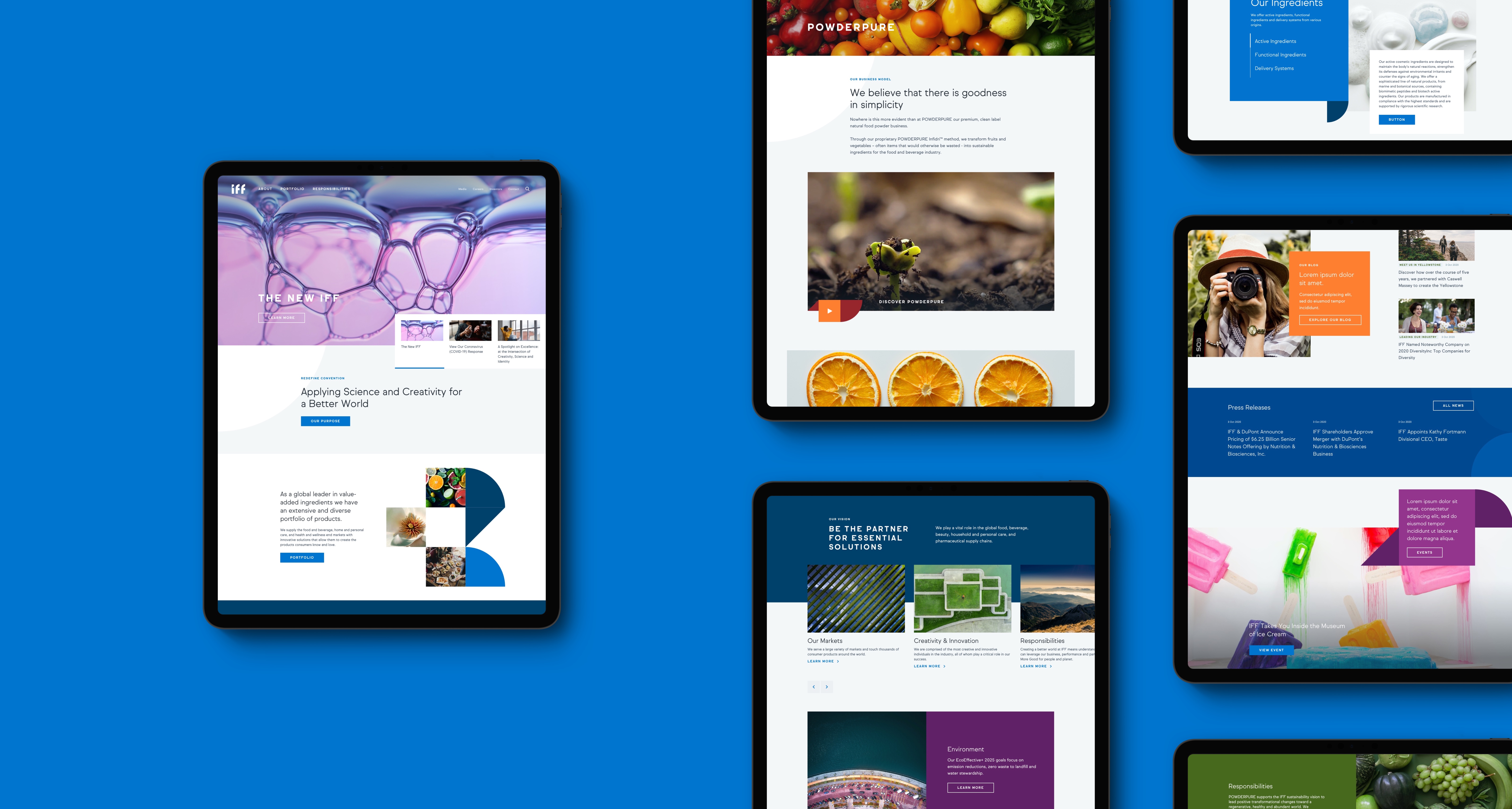
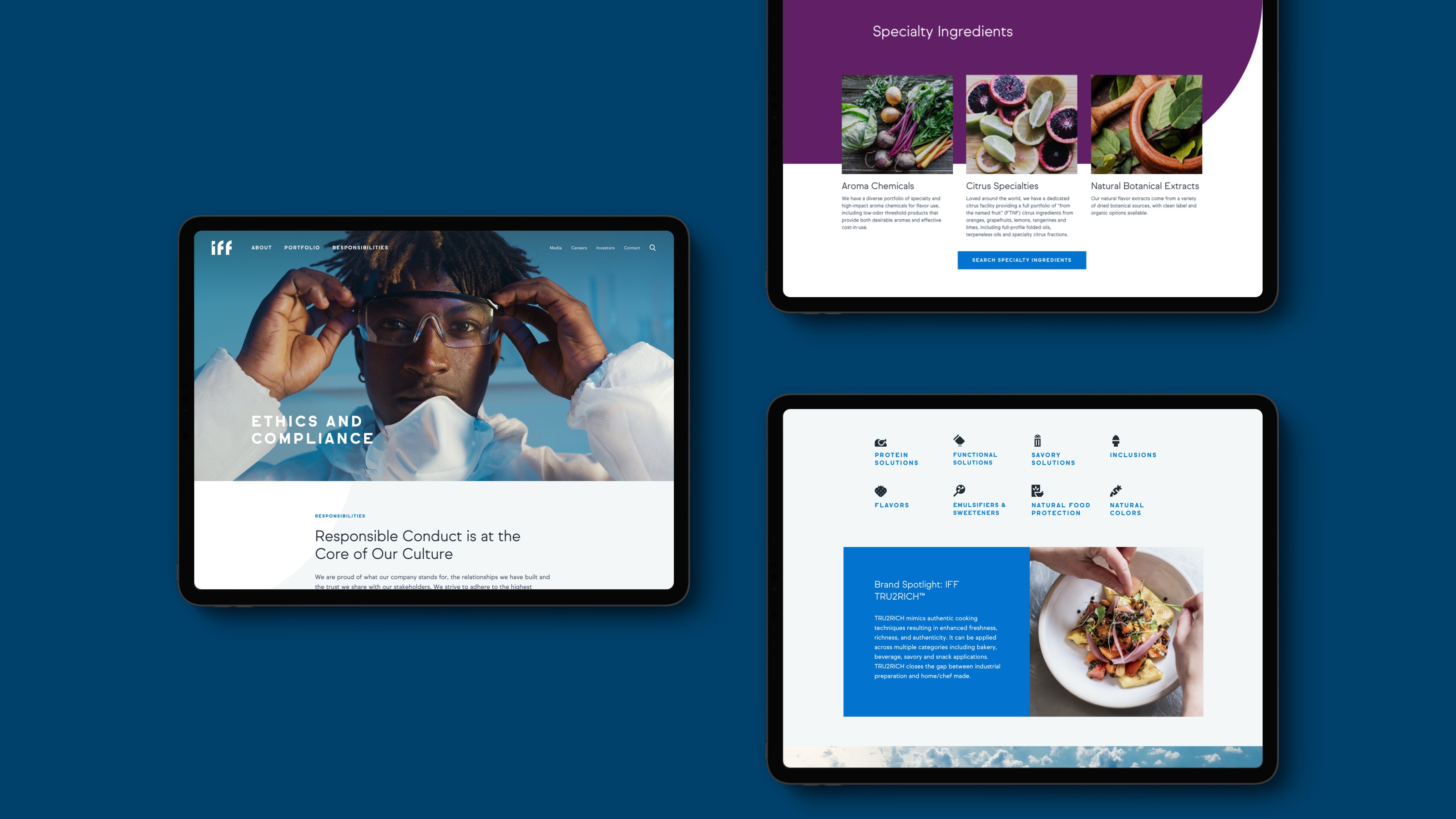

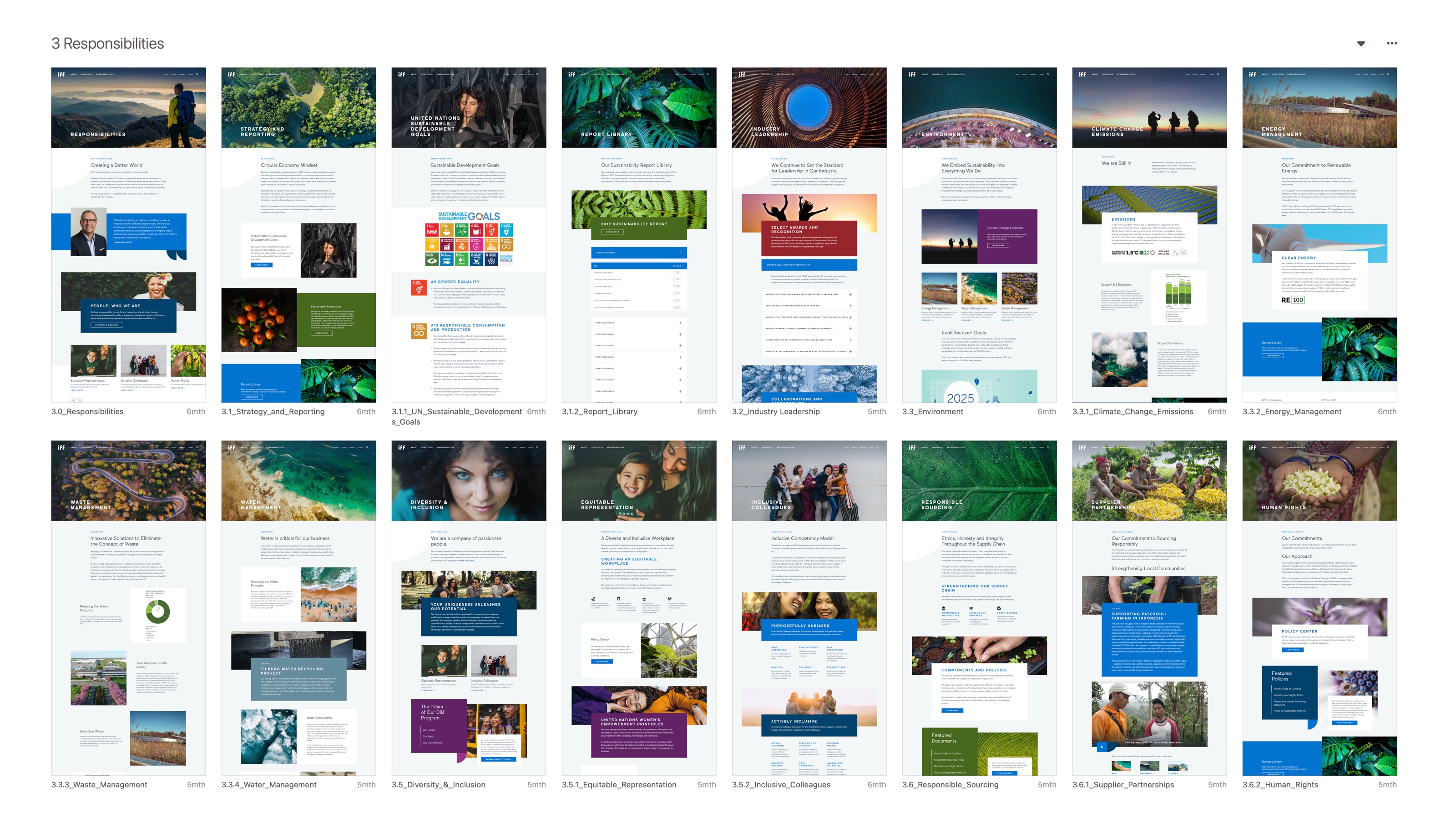 More than a 100 pages were designed and launched quickly, using the design system.
 The site menu design.
IFF India E-commerce UX Review2
Challenge:
Iff has multiple websites all over the world. One of them, the IFF India e-commerce site, failed to perform its main task – sell flavor ingredients and provide free samples to potential clients. Users added ingredients to the cart, but rarely finalized their purchases.
Process:
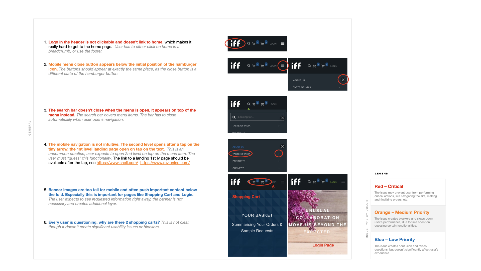
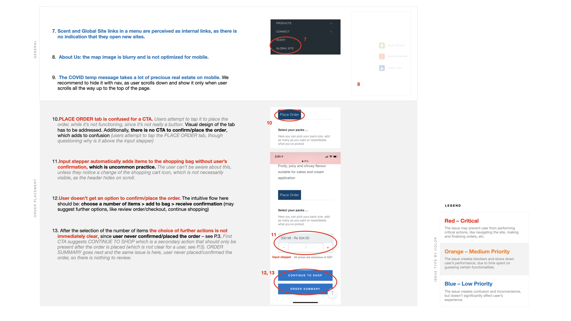
After reviewing a mobile website, I suspected a number of serious UX issues. I initiated user testing with five users and asked them to perform a simple task – order a Pinapple Royale flavor. After the testing, patterns were obvious. There were multiple issues, but the main three didn’t let customer to make a purchase:
- Input stepper autmatically added product to cart, when users added a number of products they wanted to buy. All five users didn’t realize that.
- “Place order” tab was mixed up with a button. All users tried to tap it, but as it was irresponsive (it’s a tab!), so they thought it simply doesn’t work.
- After the product selection, there was no way to approve/confirm the order. Users were provided with a “continue to shop” and “order summary” buttons, that weren’t helpful (only one user eventually tapped order summary, and was surprised to see their products in a cart.) Intuitively, they tried to tap “place order” tab.
Solution:
- Fix the user flow by replacing “continue to shop” and “order summary” CTAs by “add to cart” and a confirmation popup with options to “keep shopping” and “view cart”.
- Elliminate “place order” tab. It was used along with “free sample” tab, available for some products. Instead of separating these two actions into tabs, I laid them out on one page.
A number of other improvements were made, but these two were the main obstacles. Users didn’t have any issues finalizing the purchase on a fixed wireframe prototype.
My role:
I performed user testing and the UX review, clarified issues and dileverd solution the dev team and IFF client.
The changes are not yet live. Check out the faulty version in a meantime:
www.iff.in ︎︎︎


Amended user flow. Red indicates faulty or missing steps.

Final wireframe.

